The killer’s knife, a woman cowering before it. This was typical horror movie box cover stuff before 1991, when Dawn Baillie was asked to design a poster for a cerebral new thriller called Silence of the Lambs. She learned it was about a young FBI agent-in-training, Clarice Starling (Jodie Foster), who enlists the help of an imprisoned serial killer, Hannibal Lecter (Anthony Hopkins), to solve a case.
“It came to me that I could illustrate Silence if Clarice was the ‘lamb’ and the moth — or the bad guys — is what has left her without the right words,” Baillie explained in an email. “I think the poster works in showing vulnerability, strangeness and eeriness.”
In other words, the poster said: This isn’t your typical scary movie.
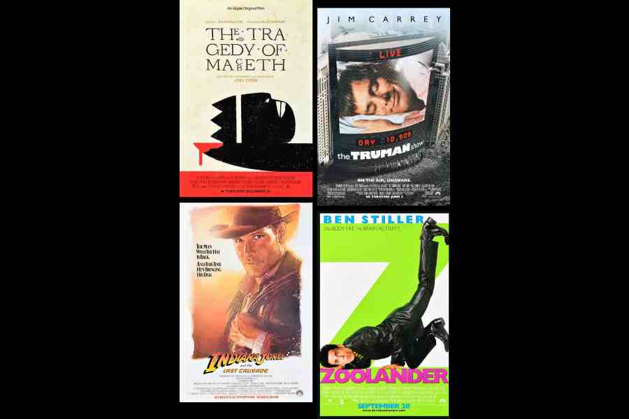
Baillie is getting marquee billing in a new exhibition, ‘The Anatomy of a Movie Poster: The Work of Dawn Baillie’, at Poster House in Manhattan. The show, through September 8, takes us from her first poster, Dirty Dancing (1987) to The Tragedy of Macbeth (2021), for which she was the creative director. Along the way are posters for films as varied as Zoolander, Indiana Jones and the Last Crusade and The Truman Show.
Baillie’s career as a movie poster designer and creative director spans over four decades. Born in 1964, Baillie entered advertising in the 1980s when the industry was dominated by men and posters were mostly made by hand, not computer. After working at the agencies Seiniger Advertising and Dazu, in 1992 she co-founded BLT, the agency behind memorable posters for recent films (Barbie), TV shows (The Last of Us) and Broadway (The Music Man).
Angelina Lippert, the chief curator and director of content at Poster House, called Baillie a “design genius” with a style defined by “effortless simplicity”. Take the poster for The Silence of the Lambs. “It’s visual anxiety that you get when you look at this, which is what makes it indelible,” Lippert said.
Baillie and Lippert recently talked about how a poster becomes a proxy for a movie itself, what’s so radical about yellow and more. The interview has been edited and condensed from questions emailed to Baillie and from a phone conversation with Lippert.
What are some things people might not realise about designing a movie poster?
BAILLIE: Most people have no idea how a movie poster is made. A lot of times there is an assumption that a film still photograph is supplied by a filmmaker or studio, and type is just added. But there are so many things to be done, from sketching concepts, art-directing special shoots and making many, many, many mock-ups and revisions to logo design and pre-press production.
How does the process start?
BAILLIE: Some projects begin with reading a script in preproduction, some start with reading a book or seeing a film, some start with such secrecy that we may only receive a meager summary.

Dawn Baillie
Then comes my favourite part: concept, research, thumbnails and doodles. We are distilling down to: What is the experience, what do you want to take away from the director’s vision? Then there is a photo shoot, or possibly not, where we start receiving unit photography, and then we try to realise the sketches.
A poster’s job is to celebrate a film in one frame. The job is well done when an audience is piqued and the poster makes it to the dorm room wall.
Why does the Dirty Dancing poster work so well?
LIPPERT: It is such a quiet, understated poster. She chose the moment where Jennifer Grey puts her arm around Patrick Swayze’s head, but it doesn’t look sexualised, even though that’s what the title suggests. It’s them with a drop shadow of lavender. We don’t know where they are. It’s an image that allows for endless questions and invites anticipation.
How has movie poster design changed?
LIPPERT: In the ’80s everything had to be done by hand for the most part. Photoshop really didn’t exist for the masses until the ’90s. If you made comparables — the ideas you want to present to your boss — you produced maybe a dozen on a Xerox machine. You had to physically play with type size until you got it the size you want. Any element in the poster would have to be hand placed. It was very labour intensive.
As you got into the digital era, you could create hundreds of comps. Today, thousands of images can now be produced for a single film. You had to be deliberate in the ’80s. In my opinion, you had to be more creative because you can try everything today.
What about the poster for Little Miss Sunshine?
LIPPERT: This is a daring and exciting poster because of all the negative space. She chose to essentially not use two-thirds of the poster and have it be a bright school bus yellow that’s pushing down on the family, and they’re all composited together into this running scene. It has this playfulness to it. It’s comical, strange, unexpected.
BAILLIE: The executive at Fox Searchlight, Stephanie Allen, gave the direction to our team to explore what she called “colour branding.” She wanted to own yellow for the season. So sunshine yellow was owned.
Who decides which poster to use?
BAILLIE: The ultimate decider is a mystery to me. Sometimes it’s a filmmaker, sometimes it’s an executive from marketing, sometimes it’s another artist, sometimes I really don’t know!
Do you have a personal favourite in the exhibit?
BAILLIE: As a mother, I love all of my children. Each poster has its own story of love, challenges, tears, and triumphs. I love the first one, for Dirty Dancing, because it gave me confidence, and I love the last because it proves I’m still capable.
Do you have a favourite movie poster designed by someone else?
BAILLIE: I have so many favourites, from M*A*S*H*, All About Eve, Straw Dogs, Dead Men Don’t Wear Plaid, The Jerk, Rosemary’s Baby, The Exorcist, Raging Bull. Ask me tomorrow, and it will be a different list.
How does it feel to be the focus of an exhibit?
BAILLIE: It feels surreal. I’m usually behind the scenes in the marketing process. I love that Angelina curated the exhibit in a way that highlights an era of movie posters from the mid-’80s through the digital change today. You can imagine how technology has broken open so many more ways to create art.
(The New York Times News Service)