Spotify has redesigned its tablet app, introducing a layout that prioritises multitasking and greater control over playback while browsing. The update, rolling out to iPads and Android tablets.
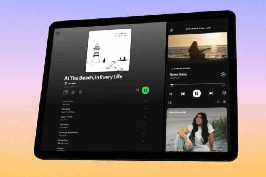
At the centre of the redesign is a new sidebar that remains visible while users navigate the app. Positioned on the right in landscape mode, the panel takes up roughly two-fifths of the display and functions as a persistent control hub. It shows album artwork, track and artist details, playback controls, and additional contextual information about the performer. The layout closely mirrors the desktop version of Spotify.
The remaining screen space continues to function as the primary browsing area, allowing users to search for tracks, build playlists, or queue songs without interrupting what is currently playing. In portrait orientation, the interface adapts to a more compact configuration, which Spotify says improves usability compared with its previous tablet design.
Video content is also being given greater prominence. A more visible ‘Switch to Video’ button allows users to transition from audio to video playback with a single tap. Once activated, the video expands into a larger viewing window, though it stops short of full-screen mode to retain playback controls and access to Spotify’s discovery features. Users can minimise the video back into the sidebar, enabling continued playback while exploring other parts of the app. For those who prefer a purely audio experience, Spotify has added a toggle to disable video entirely.
The redesign appears particularly geared towards shared listening scenarios. The persistent sidebar makes it easier to manage playback in real time, whether that involves adjusting the queue, checking track duration, or browsing upcoming songs while music is already playing. This could be especially useful in social settings, such as hosting gatherings where playlists are built dynamically.