Amelie
From the brilliant landscapes of The Fall to the blazing post-apocalyptic wasteland of Mad Max: Fury Road, here are some of our picks:
The Fall
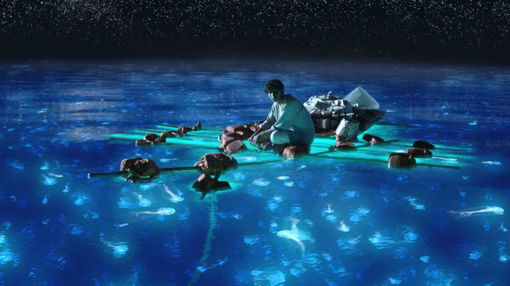
Life of Pi
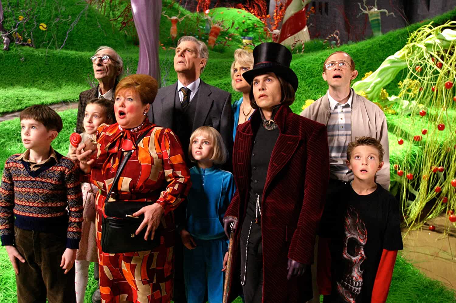
Charlie and the Chocolate Factory
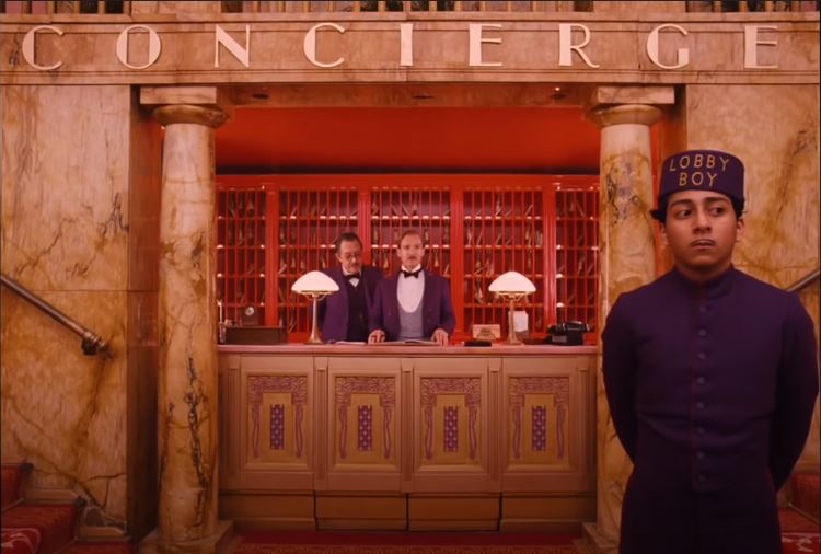
The Grand Budapest Hotel
Mad Max: Fury Road
The Zero Theorem
La La Land
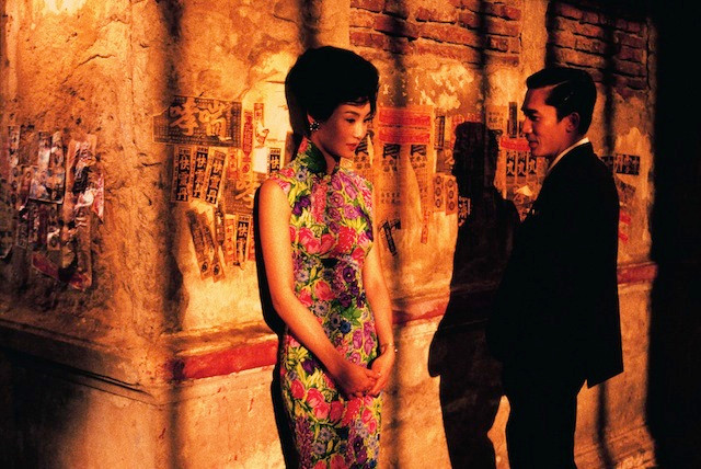
In the Mood for Love
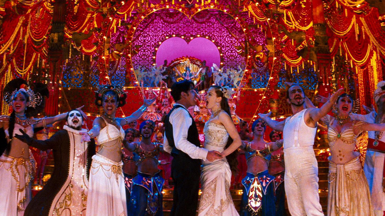
Moulin Rouge!
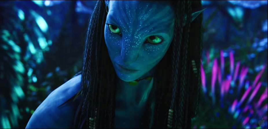
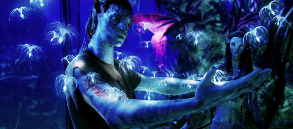
Avatar
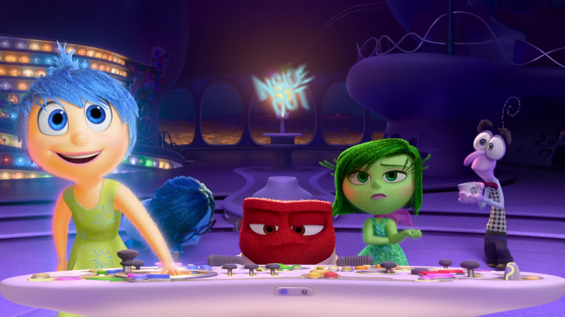
Inside Out
The Zero Theorem IMDB
Avatar Still from the film
Inside Out IMDB
Charlie and the Chocolate Factory IMDB
Life of Pi Still from the film
Moulin Rouge! IMDB
In the Mood for Love Still from the film
The Fall IMDB

Mad Max: Fury Road IMDB
La La Land IMDB
The Grand Budapest Hotel YouTube/JoBlo Movie Trailers
Amelie YouTube/Miramax
George Miller’s “revisiting” of the Mad Max franchise gave us this 2015 post-apocalyptic action film starring Tom Hardy and Charlize Theron. While its spectacular action dominated much of the post-release talk, there’s no denying that almost every frame in Fury Road was a visual delight. The stark blue of the sky meeting the orange-ness of the desert made for a striking image and the film’s colourist Eric Whipp operated on what was essentially a one-line idea from Miller: “It should be saturated and graphic, and the night scenes should be blue”. Since most of the action takes place in the desert, the makers aimed for a rich colour palette to keep the viewer engaged, as opposed to a desaturated look that most post-apocalyptic films employ. Dust clouds, sandstorms, smoke, fire... everything contributes to the vivid imagery of Fury Road, with the film’s insane and in-your-face energy benefiting from its rich hues.
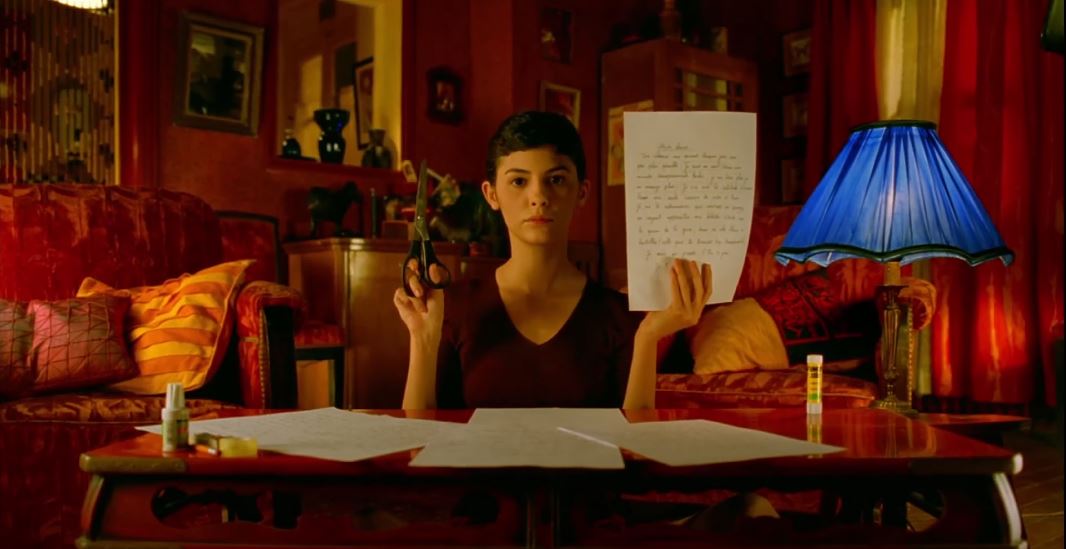
The 2001 French film, with Audrey Tautou playing the titular character, used the dominant hues of red, green and yellow to depict the various emotions that its protagonist — a shy waitress with a vivid imagination who comes into her own to make the lives of those around her better — experiences through the course of the film that was nominated for five Academy Awards. In Amelie, colour was a character in itself, with Amelie’s persistent use of the colour red — she invariably wore red (clothes to lip colour) most of the time, with her fascination for red cherries, raspberries and her red-hued pet fish Blubber being an integral part of the story and also connecting her to her childhood. While red signified passion and energy and was an embodiment of Amelie’s warmth, the use of blue depicted the sad and solitary side of her personality. Amelie offered a unique aesthetic and a mastery over colour, with director Jean-Pierre Jeunet revealing that he took much of his inspiration from the works of Brazilian painter Juarez Machado.
‘A symphony of colours’ is perhaps the best way to describe most of Wes Anderson’s films and The Grand Budapest Hotel — a 2014 drama featuring an eclectic ensemble of actors led by Ralph Fiennes — is no exception. Right from the light pink hue that imbues the first few moments of the film to the stunning colours — reds, blues, yellows, pinks, you name it — that occupy almost every frame thereafter, especially when it comes to depicting the exuberant interiors of the eponymous hotel. The Grand Budapest Hotel is a soaring narrative that blends colour and style and can be described as a painting in motion. The film has some of the most gorgeous pinks and purples that one would have watched on screen, but it also uses cold greys and blues to tonally represent its less happy moments. And yes, we want that red elevator!
Tim Burton’s films are distinguished by their colour palettes, from the darkest to the brightest, with the 2005 film Charlie and the Chocolate Factory chronicling the adventures of the legendary Willy Wonka (played by Burton favourite Johnny Depp). The film, like many of Burton’s, opens grim and dreary, but before long, Willy Wonka’s world (read, eclectic and colourful) is thrust upon us with wild abandon. From the moment the doors open to the factory, the colours pour forth, with the glossiness from the candy shells and the metallic sheen from machines adding another dimension. The hyperreal world is characterised by vibrant hues, each more magnificent and eyeball grabbing than the other. No wonder Peter Doyle, who worked as the film’s colourist, says that Burton’s main goal in the film was to “see how much colour we could get on a film print. And that’s where we are: we have about as much colour as a film print can handle!”
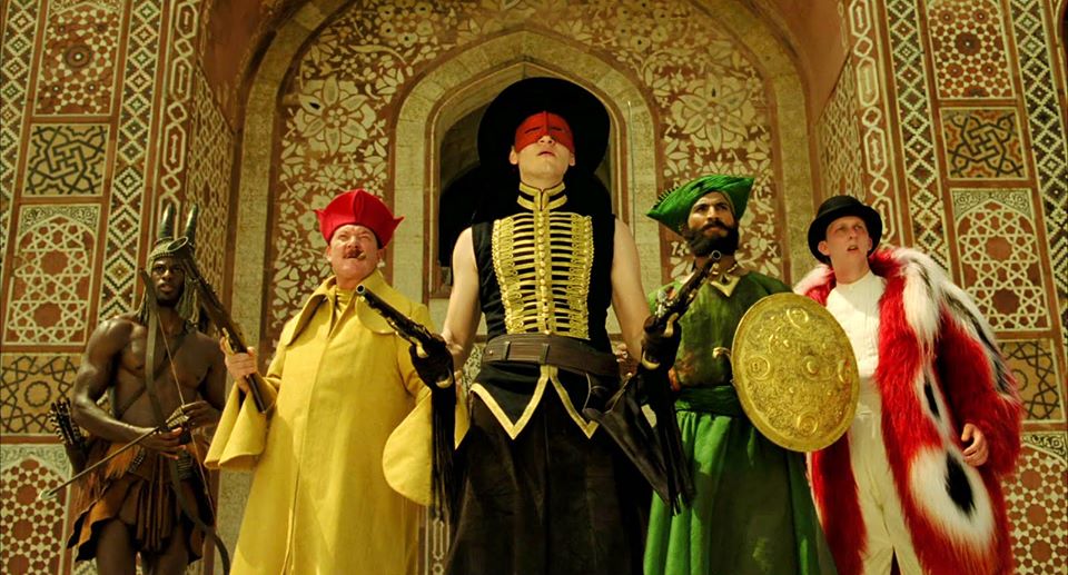
Terry Gilliam is known for his predilection for colour — think of The Imaginarium of Doctor Parnassus — and we pick this science-fiction film from 2013 directed by him that stands out for its distinctive colour palette and unconventional design to paint its otherworldly future. Besides “the girl with the pink hair” (played by Melanie Thierry), the film’s cryptic narrative about existentialism and the true meaning of life is conveyed through its brilliant use of colour, with Gilliam employing extreme colour grading techniques to come up with an intense and immersive experience. The Zero Theorem is characterised both by an exuberance and a stark absence of colour, with its protagonist Qohen Leth (Christoph Waltz) wearing only black and living in a darkened, burned-out cathedral, with very little natural light. The world around Qohen, however, is saturated by colour and whenever he is forced to interact with society, the frames are overcome by bright, rich and deep hues combined with neon, dayglow and synthetic tones, all of which depict chaos and mess.
Tarsem Singh’s 2006 adventure-fantasy film used colour to drive its plot and depict its mood, something that has now become a characteristic of the Indian-American director’s filmmaking aesthetic. The film is set in two different worlds and often meshes fantasy with reality, with the colour palette changing with the emotional crests and troughs that take place in the story being narrated by a suicidal stuntman recovering from an accident, to a young girl. Filmed over four years in 24 countries, the film uses both warm and cold tones as a narrative technique, with the fantastical being depicted through unconventional colours that keep the audience riveted. David Fincher, the man behind films like Fight Club and The Girl with the Dragon Tattoo, has praised the film’s ‘mind-bending’ exploration of colour, even going as far as to say that The Fall is “what would’ve happened if Andrei Tarkovsky had made The Wizard of Oz.”
Think James Cameron’s 2009 magnum opus — the highest-grossing Hollywood film for many years till Avengers: Endgame stormed in last year — and you will invariably be transported to the magnificent hues of the fictional exoplanetary moon called Pandora. Cameron, whose use of colour was also lauded in Titanic, made colour an integral part of the overall motif of Avatar, with the myriad hues of neon blues, pinks and greens not only being visually arresting but also playing an important part in carrying forward the film’s dramatic arc.
Besides the lush colours used to depict the various life forms on Pandora, there were its Na’vi inhabitants who were, of course, distinguished by the blue colour of their skin, with Cameron offering an explanation before the release of the film as to why he had opted for that colour. “We wanted to say that there was an otherness, an alien-ness to them. But we wanted to keep them human enough that we could understand their emotions.... we were down to blue and green basically — and green had been taken by all those Martian movies with the little green men. So, we have big blue women, not little green men.” On a more serious note, the use of blue to depict the Na’vis, Cameron said later, was to make a statement against distinctions made on the basis of race and skin colour. For the record, Cameron spent 15 years developing the world — technology to look — of Avatar.
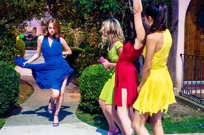
Damien Chazelle’s six Oscar-winning musical was awash with bright, saturated colours to hark back to a palette of Hollywood in the ’50s and ’60s. Sebastian (Ryan Gosling) and Mia’s (Emma Stone) love story unfolded against the backdrop of myriad hues, starting from the moody palette in the Lighthouse Cafe where Seb first meets Mia after work, and the colour of Mia’s blue jacket, with the blue wall in the background, disappointed as she is after a failed audition. Colour — that vision of Mia in yellow as she and Seb hug and dance against the vibrant blue of the Los Angeles skyline is the film’s most distinctive image — propelled the narrative of La La Land, with Chazelle building a world lush with imagery and using colour to blend fantasy with reality. This is a film about dreams and Chazelle uses colour — predominantly red and blue — to depict the struggles of two people surviving and falling in love in an unforgiving city. The fact that its backdrop is the Hollywood of yore means the use of Technicolor. So many vibrant images stand out... the musical moments when Mia steps out in blue with her friends for a night out to her apartment decorated with patterned rugs and pillows, striped furniture and bold textiles.
The 2000 Wong Kar-wai classic was bathed in deep reds and oranges, with black playing an important role in its narrative. The film’s highly saturated jewel tones were used succinctly to emphasise its strong melodramatic core and the singular emotions of its protagonists. Red was dominant — billowing curtains to the outfits worn by Su Li-zhen (Maggie Cheung). A tale of loneliness and unfulfilled desire, the film’s breathtaking use of reds and blacks captured the suppressed intensity of the forbidden romance between its protagonists as well as the shadows of secrecy it was destined to be relegated to. Sudden bursts of flame, the image of red lipstick left on a still-burning cigarette, the green sarong that Su wears when she and Chow (Tony Leung) part... all of it contributed to Wong Kar-wai’s genius (aided by his longtime aide and cinematographer Christopher Doyle) in his use of colour as cinematic symbolism.
While the use of vibrant colours is a given in animation films, emotions showed their true colours in the Oscar-winning Pixar film Inside Out. The film plays out in the mind of a lonely and imaginative pre-pubescent girl where five personified emotions jostle for space and help her adjust to her new life after she shifts from Minnesota to San Francisco. Each of these emotions come with their individual colour, with Joy being yellow, Fear is purple, Anger being red, Disgust being personified as green and Sadness depicted by blue. Each of these colours is also used to connect to specific memories in the protagonist Riley’s mind. They shine brighter than the usual memories and are essential when defining who Riley is as a person. The film also often gave way to a grey palette to personify Riley’s riled-up state of mind. The importance of colour in a film like Inside Out — which makes it to almost every best film, leave alone best animated film list — cannot be overstated.
When Ang Lee brought alive Yann Martel’s famously “unfilmable” book on screen, we couldn’t tear our eyes away from the images, many of which have been deeply seared into our memory. Like the rich blue sky under which Pi carries on with his adventures on a boat, a tiger for company, or the symbolism of the colour orange which is mentioned a number of times in the book and often springs up in the film. During his travel on the high seas, it is the presence of orange-coloured objects that gives him both the will and the hope to survive. In a film that’s rich with symbolism, colours are used to both drive the story as well as employed as symbols. Many scenes stand out... like the boat floating serenely on the water as the sun rises and casts a brilliant orange glow over the world. At night, jellyfish illuminate the ocean from below and give the water an unworldly, ultraviolet blue....
Baz Luhrmann is known for the vibrancy he lends to his films. The Great Gatsby will be an apt pick, but we lean more towards Moulin Rouge!, a smorgasbord of colour, music, style and Bollywood that the Australian filmmaker brought to his 2001 film, a vivacious Nicole Kidman for company. Moulin Rouge! is saturated with colour in its lighting, costumes and sets, with reds, purples and golds figuring prominently in the nightclub scenes. When the scene shifts to the poorer sections of Paris, the rich colours fade to shadowy blues. Like in many of his other films, Luhrmann used colours in Moulin Rouge! for both their emotional and transportive qualities. The film takes place in a sort of heightened reality and the use of vivid colours, especially in the musical scenes, contributes to its theatrical and high-on-energy look and feel.