 |
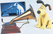
What’s in a name? Or more precisely, with apologies to the Bard, what’s in a brand name? The question has come up because after 100 years, Nipper, the loyal dog listening to His Master’s Voice, is being replaced by an animation dog called Gromit.
HMV is at pains to point out that the experiment is for three months only and that Gromit — a plasticine dog from the Wallace and Gromit animated series — will be restricted to advertising aimed at selling children’s DVDs. Nipper is not under threat and will continue in all other HMV advertising.
And in India, those accustomed to the old logo need not worry at all. The HMV logo in India belongs to the RPG group and a top group source stresses that it has no plans of changing it. “It’s iconic and has stood us in good stead for years,” he says. Adds Subroto Chattopadhyay, managing director of the RPG Enterprises-controlled SaReGaMa India Limited, which uses the HMV trademark, “We have nothing to do with the proposed logo change.”
But two questions surface here. First, in the dog eat dog world of the multi-billion pound music business, is HMV in the UK testing the waters for more radical change, as some suspect? The company has suffered from falling profits and may believe that a change in logo will bring about a change in its fortunes. Sushil Khanna, who teaches economics and strategic management at the Indian Institute of Management in Calcutta, stresses that the logic behind changing age-old logos is related to inevitable shifts in the market environment. “A company’s decision to change the logo could be related to a product or service not going as well as it used to earlier.”
Secondly, and more fundamentally, is it worthwhile altering or changing iconic logos? As the Bangalore-based Sujata Keshavan, managing director, Ray + Keshavan Enterprise IG, which has been responsible for several corporate logos, points out, “It takes years to establish a brand and a logo.” Adds Harish Bijoor, CEO, Harish Bijoor Consults Inc, “A logo makes five times more impact on a consumer than the oral language that any brand speaks.”
 |
| Imagine! Air India's Maharaja made over. Illustration: Uday Deb |
There have been few images more endearing than that of Nipper, listening faithfully to the voice of his long dead master. Nipper, so called because of his tendency to nip visitors’ legs, was part Fox Terrier and part Jack Russell. He lived in Liverpool towards the end of the 19th century with his master, Mark Barraud. When Barraud died, his artist brother, Francis, inherited the dog. The latter had also acquired his late brother’s Edison-Bell Phonograph, an early cylinder recording and playing machine.
The artist noticed that Nipper would sit by the phonograph, not quite able to work out where his master’s voice was coming from, and conceived the idea of committing the scene to canvas. So in 1898 he made an oil painting of Nipper, which was purchased for £100 in 1899 by the Gramophone Company. Now valued at £600,000, it hangs at the EMI headquarters in Wright’s Lane, Kensington.
Nipper had immediate recall — somewhat like the turbaned Maharaja of Air India. Like Nipper, the Maharaja is perhaps India’s only iconic logo, defined as one that the company involved is closely identified with. And like Nipper, the Maharaja was once eased out too. In the late Eighties, floundering Air India hired an international firm, Landor Associates, for a new logo. Landor came up with an image of a rising sun on an orange sash. Within two years, however, it was done away with. “The (new) logo was highly criticised. It did not match Indian values and culture,” says Air India spokesperson S. Venkat.
Logos have been redone in recent years by companies such as Tata Motors, Hindustan Motors, Bajaj Auto, Mahindra and Mahindra, Dabur, the Kinetic group, Standard Chartered and the Bharti group (Airtel). Soni Shrivastav, spokesman at Hindustan Motors Limited (HM), points out that when HM changed its logo, it wanted to be more contemporary. “But we also wanted to keep the spirit of the old logo. So we incorporated road signs in the new one, which is apropos to our business — passenger cars,” she says.
Bijoor stresses that most logos of old companies — such as HMV — were designed in days when only black and white printing was available and there were limited fonts to work with. “Now, the consumer wants slick looking images. So logo are going back to the drawing boards,” he says.
Companies, clearly, feel the need to move with the times. When the Bharti group entered the Indian telecommunications market, the telecom industry was new. “As the industry changed, the company decided to opt for a logo that was young and contemporary,” says Keshavan. She adds, “In the earlier days, there were only a few brands in the market. Now with growing competition companies are changing every aspect of the brand — from logo to branding — to catch the customer’s eyes,” she says.
HMV — founded in 1921 and with headquarters in Maidenhead, Berkshire — is hoping to do just that. Last year, the profits of the company, which sells music, videos, DVDs, book and computer games, fell by 20 per cent. Gromit, not surprisingly, has been introduced in time for Easter shopping.
HMV is a great brand, its chief executive Simon Fox acknowledges, “but has not adapted quickly enough to the way customers are now buying and consuming media. Our performance has suffered as a result.” HMV’s official spokesman, Gennaro Castaldo, holds that the move is “a merger of two much-loved logos.” And the change, he stresses, is for an initial three-month period. “But we’ll be discussing an extension of this and other ways that we can work together in the future,” he says.
Logos, some stress, are not timeless entities. “Logos need to refreshed with the times,” says Sudhir Sharma, founder, director and principal designer, Elephant Design and Strategy, which constructed a new logo for Bajaj Auto when the company shifted from rolling out scooters to motorcycles. “Consumer perception is of paramount importance,” he says.
Sometimes, as the Air India story demonstrates, logo changes can prove extremely unpopular. Imperial Airways and British Airways were merged in 1939 to form BOAC (British Overseas Airways Corporation) — its neon-lit sign was once part of the Calcutta night sky. But when BA, formed from the 1972 merger of BOAC and BEA, shed the Union flag in 1997 and introduced abstract world images, Margaret Thatcher once famously covered the offending tail fin on a model with a handkerchief at a Tory Party conference. “We fly the British flag, not these awful things,” she protested.
Closer home, there is the experience of Asian Paints which did away with its logo and mascot Gattu. But the absence of Gattu, a scruffy little boy, was sorely felt. Bijoor says there are rumours that the company will get Gattu back.
Old logos don’t die. But sometimes they haunt.