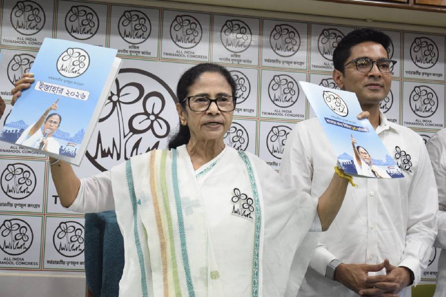
 |
 |
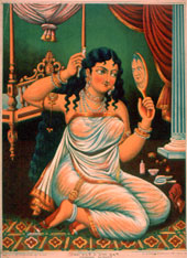
| Popular prints: Lithographs on display at the Birla Academy |
Everybody sees them all the time because they are everywhere, those usually garish and stylised pictures of gods and goddesses and mythological scenes. Pasted on grimy walls of teashops, perhaps. Or sitting, framed, among the deities of Grandma’s puja alcove. Or lending period flavour to some battered publication as a quaint colour plate.
Such pictures ? lithographs and oleographs ? recall a period when the camera wasn’t yet commonplace and offset printing was yet to arrive. An unusual show being hosted by the Birla Academy of Art and Culture till March 25 brings before viewers a wealth of prints from a private collection. Titled The Aesthetics Of The Popular Print and curated by art historian Tapati Guha-Thakurta ? who also writes a researched piece in the catalogue published on the occasion-it covers the span of almost a century, starting in the 1870s, with a rich sampling of prints from different presses not only in Calcutta and other Indian centres and Western India, but also Germany, Luxembourg and Switzerland.
The show unfolds a fascinating narrative in terms of iconography and ideas, techniques and styles. There are a few realistic portraits in monochrome from the late 19th century that reveal sound training and are printed by Calcutta Art Studio. As Guha-Thakurta points out, “art” is preserved as the middle name, so to say, by other presses, too. Like Chorebagan Art Studio, Kansaripara Art Studio and Imperial Art Cottage which seem to have catered to different tastes, both religious and risqu?.
So while Radha and Krishna in shimmering clothes with improbably lavish folds are placed in landscapes that quote miniature stylisation, the curvaceous Pramada Sundari in a diaphanous sari preening herself before a hand-held mirror ? a gesture enshrined in the lexicon of the Indian arts through sculpture, painting and dance-brings to mind Kalighat pat. Though perspective isn’t quite mastered, an appetite for elements of Western art seems evident.
This delicious promiscuity spices the prints with a kind of profane colloquialism, even though the subjects may be sacred and the figures inert. An example of the mix and match of styles is an oleograph from the Ravi Verma press, Yashodha-Krishna, a Hindu reworking of the Madonna and Child theme in a setting that’s strikingly early Renaissance art. In fact, Ravi Verma’s attempt to wed the visual grammar of Western naturalism to Indian subjects spawned a genre that’s well represented, though the technical awkwardness of lesser artists in handling dramatic tableaux isn’t quite overcome. But Verma himself is also included. An example is Jatayu Vadha, which imports the dynamic charge of his Ravana and Jatayu to the oleograph.
What will interest the informed are prints by identified though less-known artists such as Bamapada Banerjee and Shital Bandopadhyay from Calcutta and four names from Western India. But there’s much to engage the untutored eye as well. For instance, a litho titled, tellingly enough, Jampuri ba Paper Sashti warns, in its panel of pictures, of the dire fate awaiting errant sons and straying wives in hell, and even slayers of-guess what? ? the go-mata.
The last indicates the corrosive communalisation of politics from the late 19th century. Therefore, though Tipu Sultan figures in a print, the strident Hindu nationalism of Maharashtra is declared in Liberation of the Motherland.photographySujoy Das