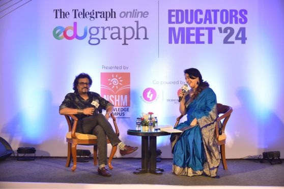


Satyajit Ray’s birthday ignites a sense of community among admirers
Sohini’s recent IG post will make you sing ‘Starry, Starry Night’
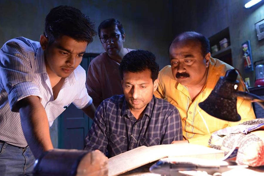
‘The Commandant’s Shadow’ is sure to send chills down your spine
Make yourself a fancy summer tipple at home with this iced tea recipe
The Big Family blues band to take centre stage at Skinny Mo’s Jazz Club
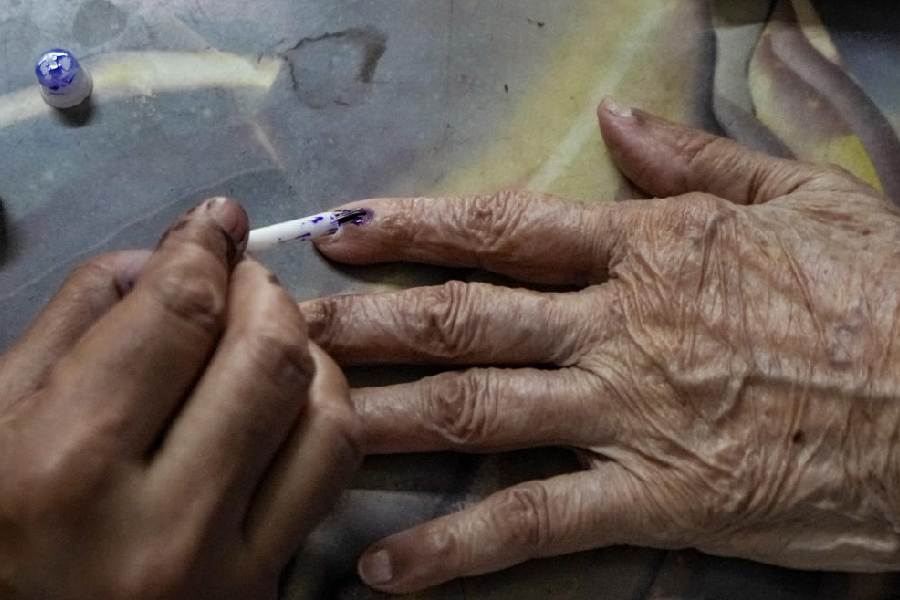
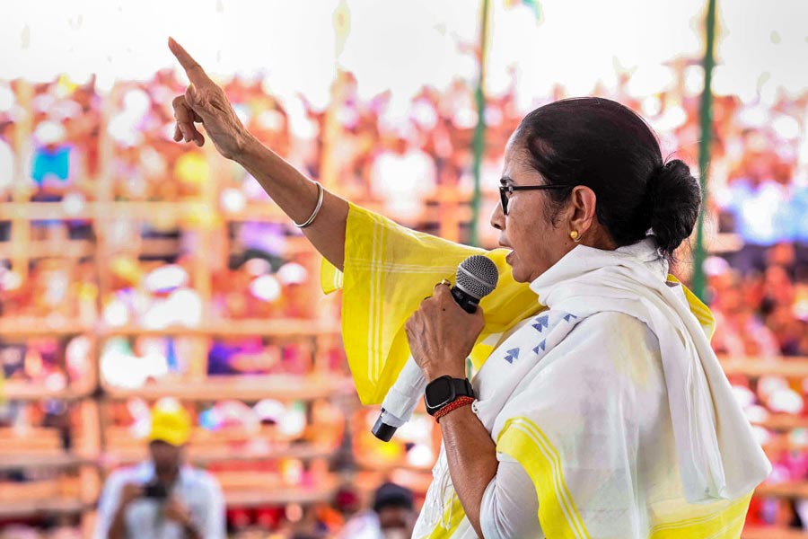
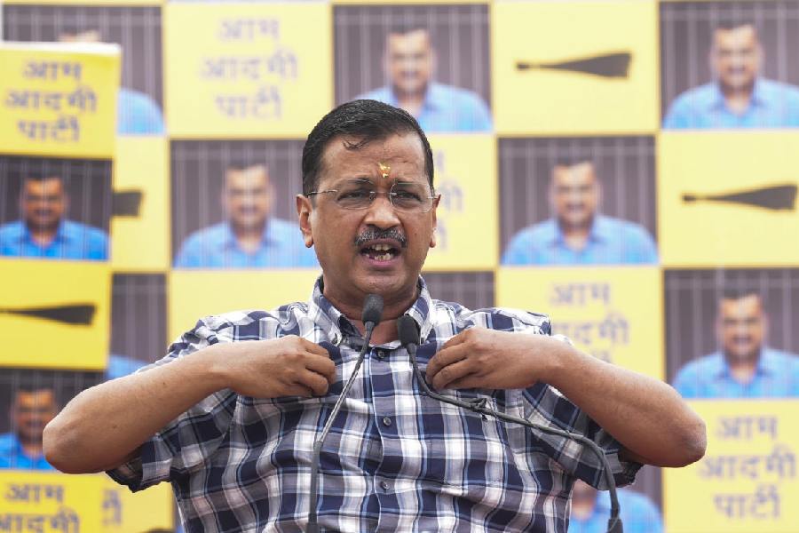
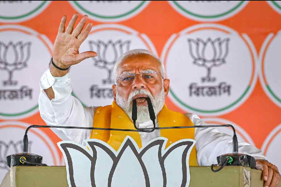
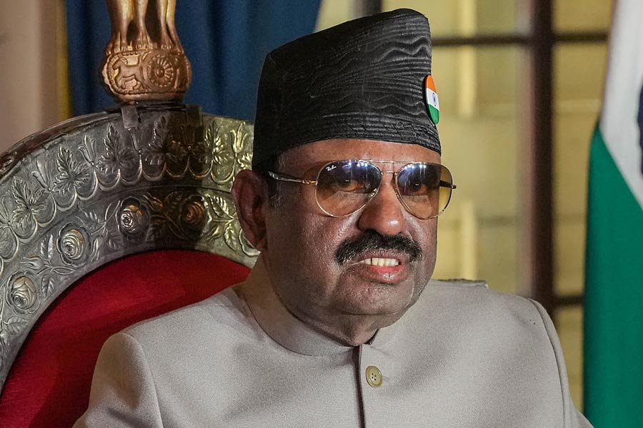
The cumbersome, seven-phase 18th Lok Sabha election heightens the drama with ominous warnings that Sikkim might one day acquire a Bihari or Marwari chief minister
SUNANDA K. DATTA-RAY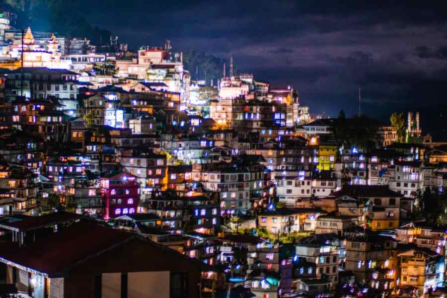
When the Babri Masjid was demolished, the response in Kerala was driven by secular values. But now I find that some people are openly supporting such indefensible acts
R. RAJAGOPAL
FRA seems to be a crucial issue in many constituencies — most acutely in states like Jharkhand, Madhya Pradesh and Odisha — that are going to the polls in the remaining phases of the elections
JAIDEEP HARDIKAR
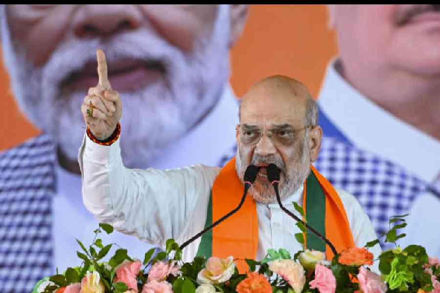
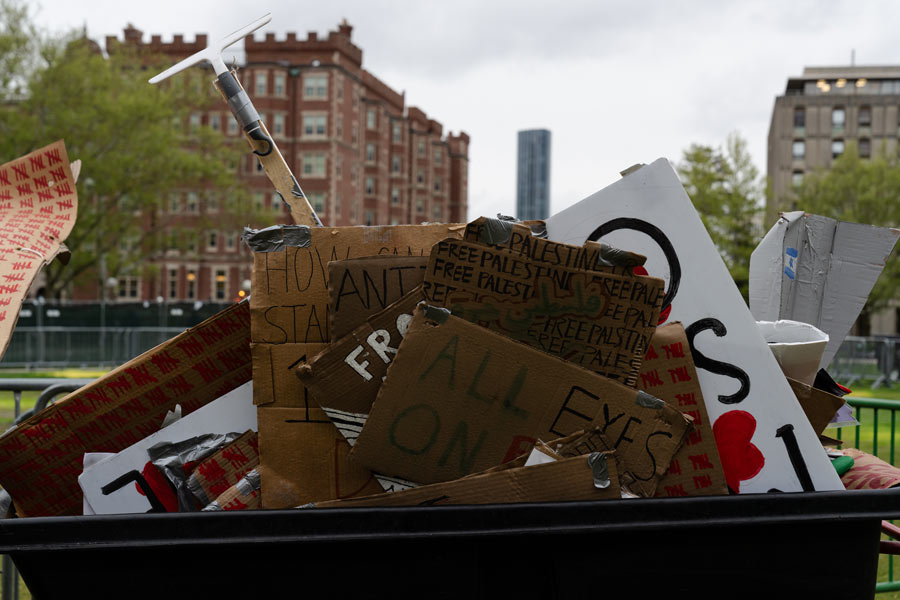
Intervening on social media, a chronicler of contemporary India recently complained that 'In fifty years of observing Indian elections I have never seen such vile and hate-filled rhetoric'
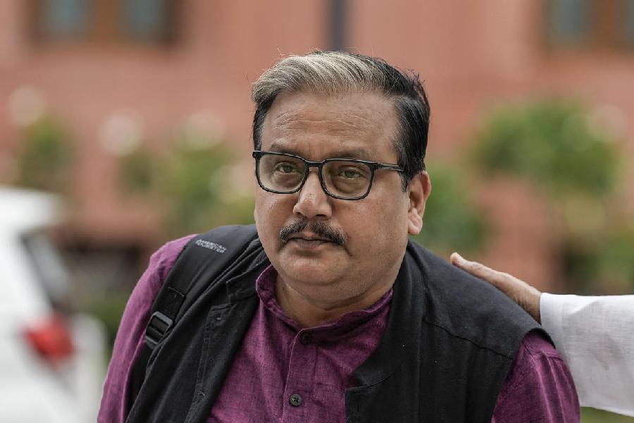
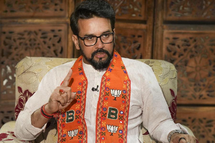
SWAPAN DASGUPTA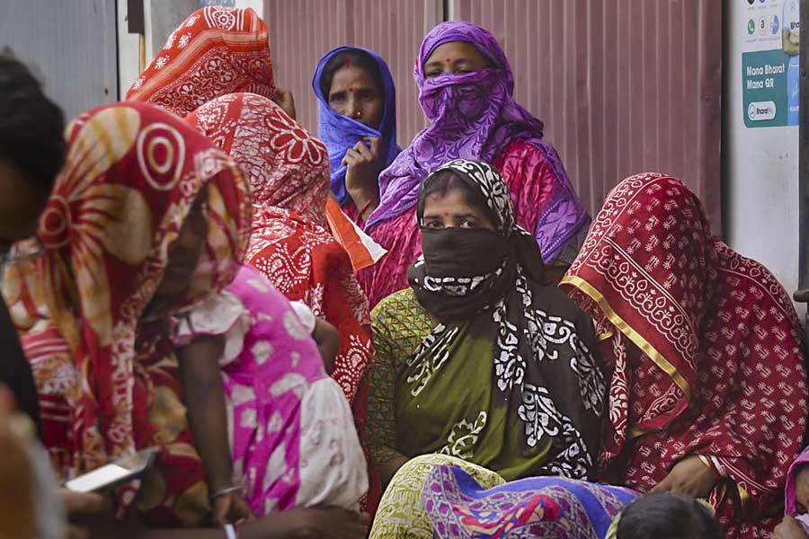
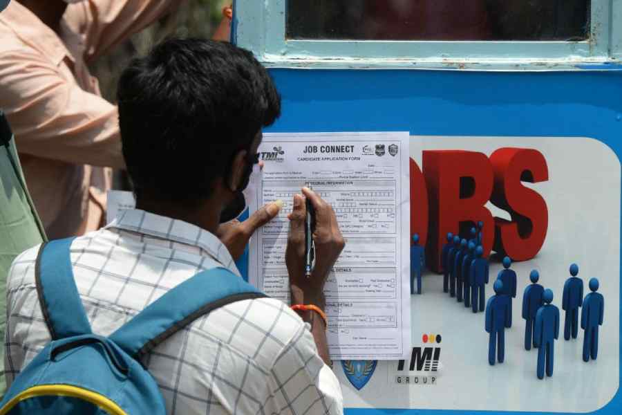
Intelligently devised welfare measures that assure amenities like healthcare, education & employment for women are a necessity in a deeply inequitable & patriarchal country like India
THE EDITORIAL BOARD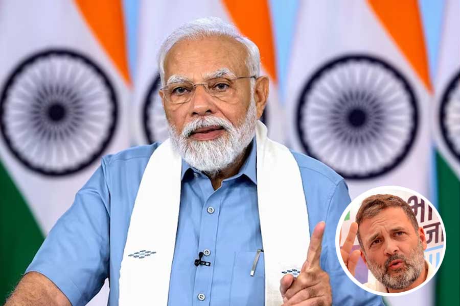


Touted as the veteran Japanese filmmaker’s final Studio Ghibli project, The Boy and the Heron bagged the Best Animated Feature award at the 96th Oscars