


Finally, ‘The Family Man’ S3 is in production!
Deepika’s ‘Piku’ throwback will make you misty eyed
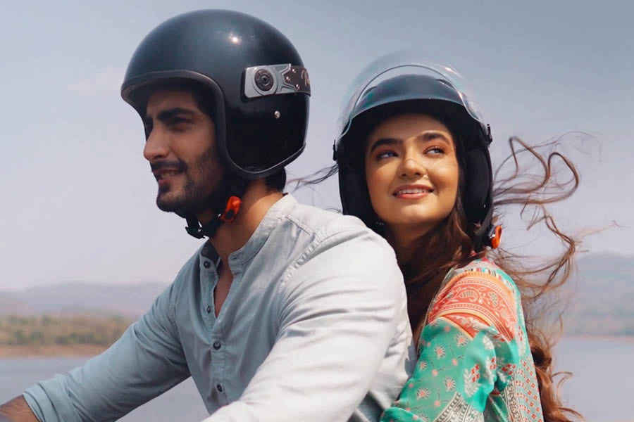
This English dub of ‘What Jhumka?’ will make you giggle for sure
How about having some crunchy, munchy Bhel for breakfast?
Tune in to Iman Chakraborty’s song from the album ‘Boishakher Panch Gaan’
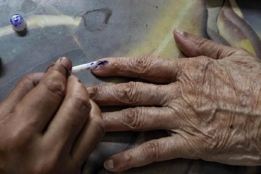
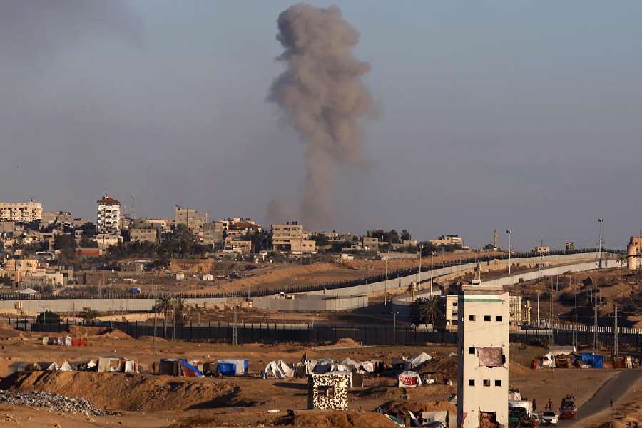
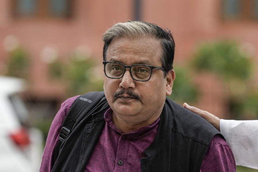
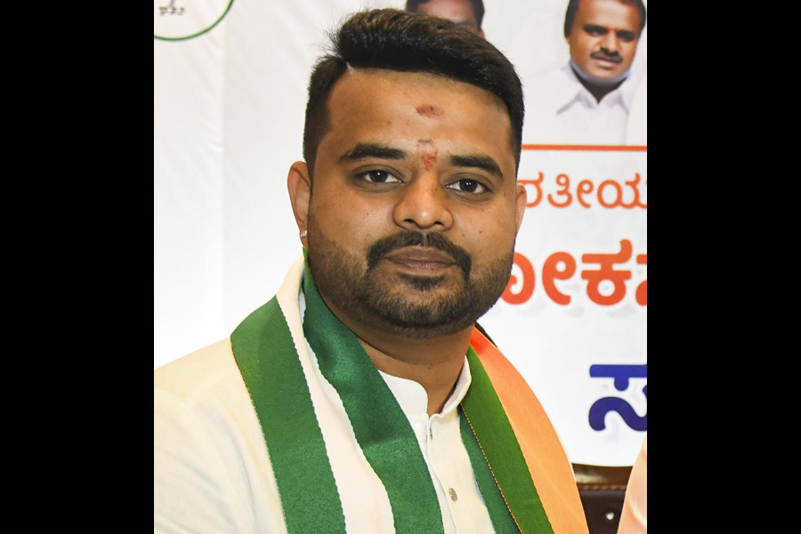
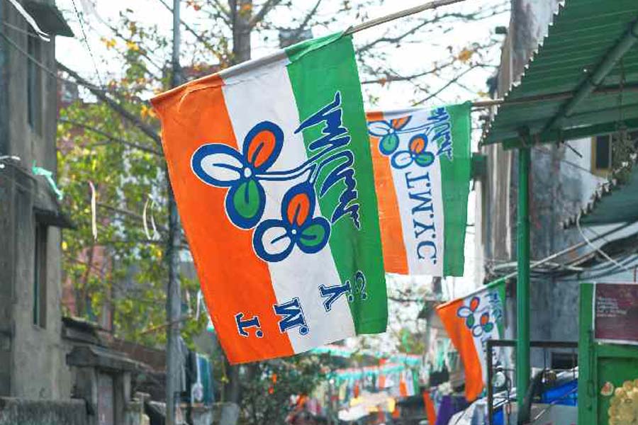
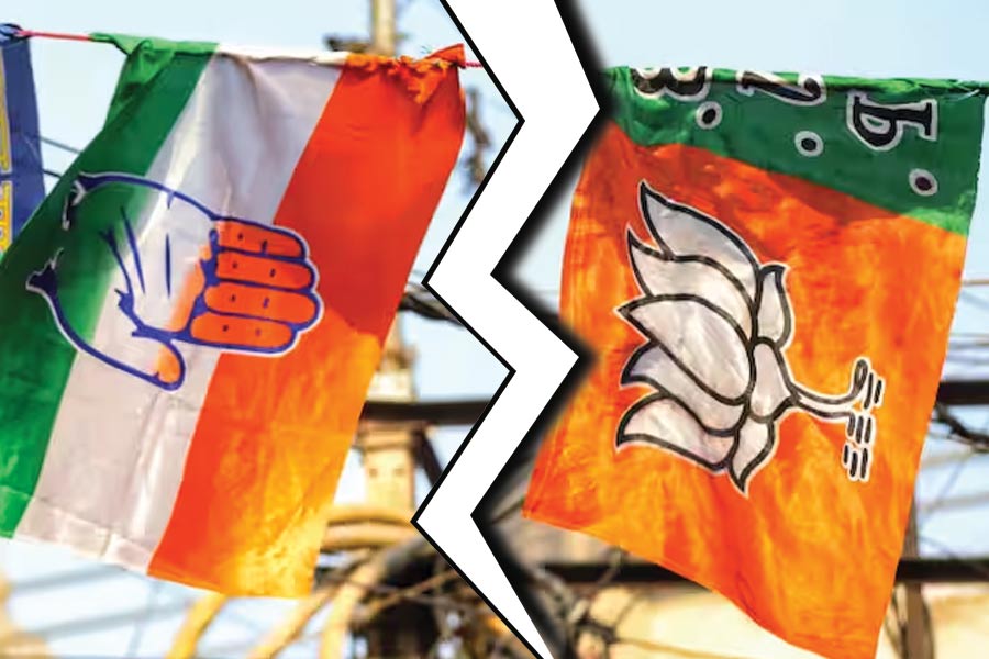
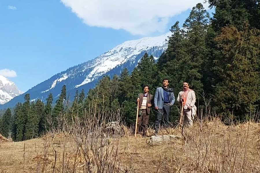
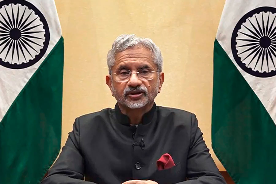
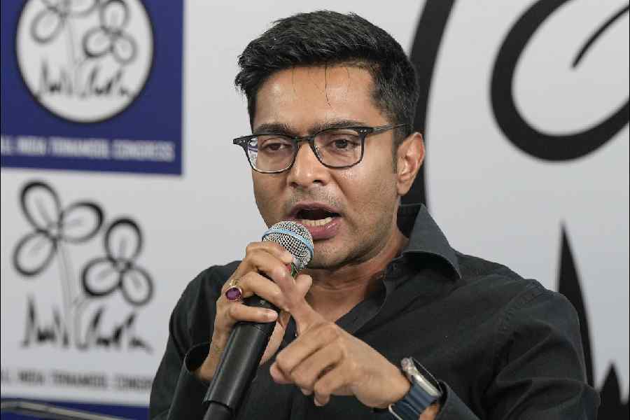
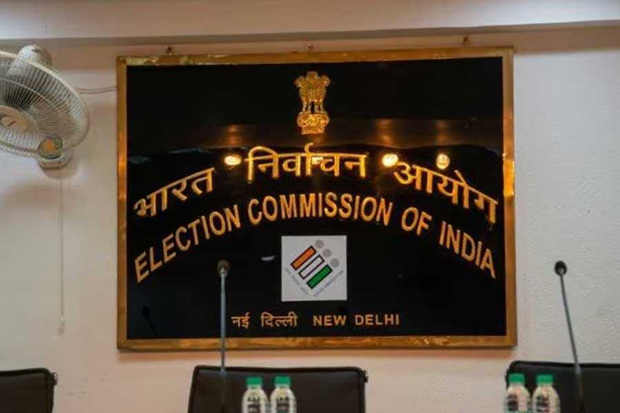
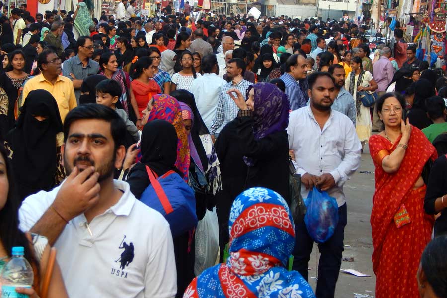
Intervening on social media, a chronicler of contemporary India recently complained that 'In fifty years of observing Indian elections I have never seen such vile and hate-filled rhetoric'
SWAPAN DASGUPTA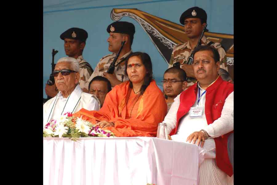
Travel writing was historically a lowbrow genre, both in terms of financial success & academic respectability, until two books appeared. One by Paul Theroux & the other by Paul Fussell
ABHISHEK CHATTERJEE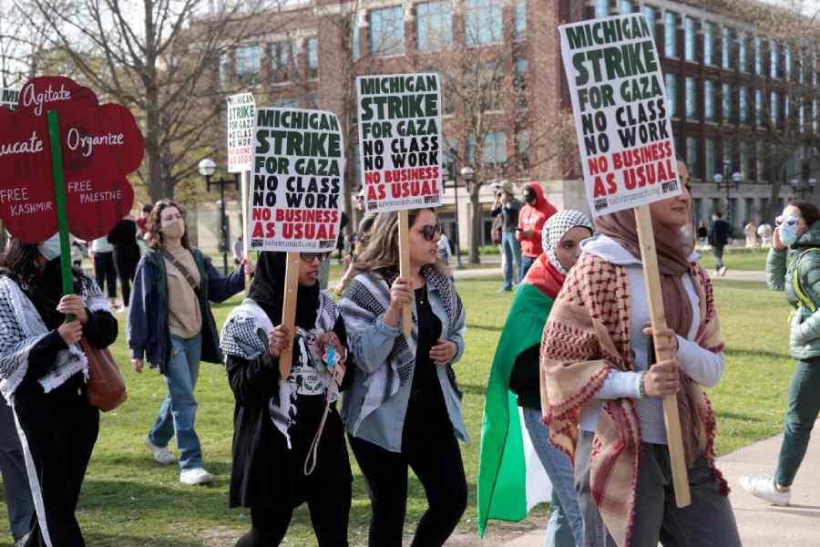
The current attempt by the American Right, therefore, is to change the nature of universities so that speaking the truth no longer remains their avowed objective
PRABHAT PATNAIK
Science should be rational and unaffected by political interests. Scientists should work with integrity and shouldn’t distort scientific results to please the political elite
BIJU DHARMAPALAN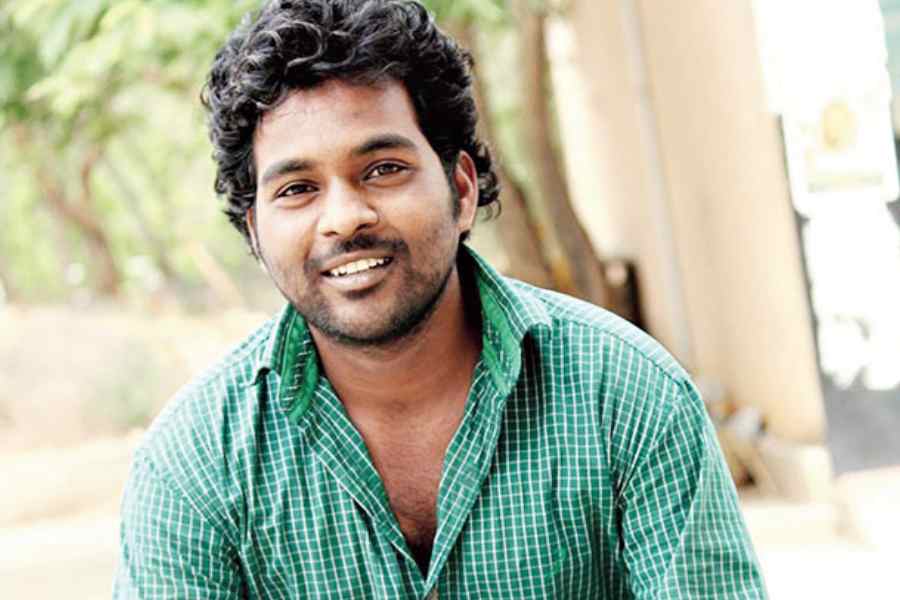
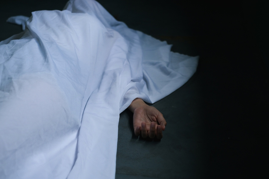
Apart from projecting Vemula’s reasons for suicide as ‘personal’, report says Vemula never expressed any discontent with the university, ignoring his sarcastic letter to the VC
THE EDITORIAL BOARD


Adapted from Andaleeb Wajid’s 2016 novel Asmara’s Summer, the series is directed by Debbie Rao and stars Anushka Sen in the lead role